Pixel Art Styles
I've been thinking about pixel art recently and how I'd like the graphics to look in the first person maze game demo I'm making.
This post is currently in progress and I'll be writing a bit more about colours and linking to some interesting posts.
Limits
I really like the style of some of the Gameboy Color and Neo Geo Pocket Color games and how the artists were able to make clever use of the limited colour palettes.
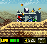
There's a couple of games that show the kind of style I'm thinking of, Rockman X: Cyber Mission on the Gameboy Color and Metal Slug: 2nd Mission on the Neo Geo Pocket Color.
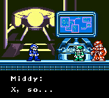
I think it's nice how the main character sprites have dark outlines to bring them into the foreground and how different elements are done using colour ramps with colours of a similar hue, e.g. using just all greens for trees and leaves, purples and pinks for enemies, and blues for the player character. I think it gives the graphics a nice style.
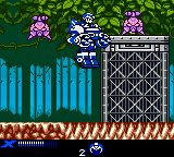
The use of softer muted shades for the background and brighter saturated colours with dark borders for foreground objects also helps the player to see which elements are active threats and bonuses and which elements are passive decoration.
The Gameboy Color had a limitation of three colours for sprites, according to Wikipedia which may account for the graphic style in these games.
The specific Game Boy Color (Type 3) game cartridges presents up to 56 colors without the use of special programming techniques from the full 32,768.
From these, 32 are for a background palette, plus 8 hardware sprite palettes, with 3 colors plus transparent each.
Typically sprite palettes share some colors (black, white or others), so the total colors displayed may be less than 56.
The Neo Geo Pocket Color also had a similar restriction with four colours.
Emotes
A consequence of having a limited number of colours in these games is that the sprites end up having an almost line-art cartoon quality.
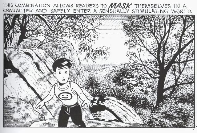
There's an interesting bit of analysis in Scott McCloud's book Understanding Comics around simplified cartoon characters called the Masking Effect.
Masking (or the masking effect) is a visual style used in comics, first described by American cartoonist Scott McCloud in his book Understanding Comics: The Invisible Art.
McCloud argues that characters with simple but recognizable designs, which he terms "iconic" characters, allow readers to project themselves into the story by using the characters as a "mask".
He further argues that the juxtaposition of iconic characters with detailed backgrounds, characters, or objects can create meaning and strengthen or weaken readers' emotional and psychological connection to certain elements of the graphic narrative.
Masking can be found in various media outside of comics, such as animation, picture books and video games (especially visual novels).
Masking is commonly used in manga and anime; McCloud states that masking "was, for a time, virtually a national style" in Japan.
I think there’s some truth in this and this is why cartoon style characters are popular and we see them as being more emotive and friendly than realistic depictions.
As these games are both Japanese, the style may tie into the traditions of Anime and Manga, Kawaii and mascots although I think the use of cartoon characters and mascots is universal across cultures.
It sounds a bit odd but I do think this empathy felt towards cartoon game characters makes for a more emotive and engaging gameplay experience.